Boomerang Ideas
Project Summary
Boomerang Ideas is an online tool that people can use to validate a business idea or a customer group. Users enter the question they would like to feedback on and define the audience they would like to ask it to. Using the crowdsourced power of social media, Boomerang Ideas collects the feedback and converts it into usable insights.
The scope of this project is to design a responsive website that will convince users to try our product.
Research
The project is a follow up to a previous project where I designed the Boomerang Ideas Web App. See full case study. Before beginning the Web App project, I interviewed 15 participants from our potential target markets: Startups and SEMs.
I used the research findings from the Web App project to inform the design decisions in the project.
- love choosing & developing business ideas
- get bogged down in paperwork & logistics
- try out new tools to do things themselves
- find it difficult to make decisions with only 2 or 3 team members
- want a free tier or trial
- want it to connect with their other tools
- use sales stats to make decisions
- put a fully developed product out and see what clients say
- find it difficult to get feedback from the right people
- generally ask their personal networks
- find it difficult to access people outside of own networks
- ask previous clients for feedback
- want to poll very specific groups of people (dentists, people in X neighbourhood)
- want a quick and easy service that provides feedback from their potential customers
- want human support & consultation
- are not sure how to phrase their question
- are not sure how they should choose a target market to test
- are skeptical of how many insights they can gather from one question
- want qualitative feedback as well
- want A/B testing
- want the option to schedule an interview with interesting participants after
Synthesize
While working on the Web App, we made two research-based personas. I used the same personas here.


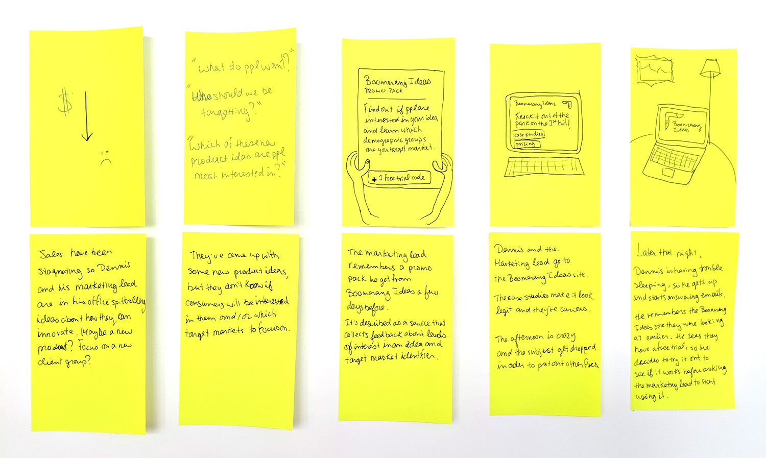
For each persona, we created a storyboard to explore how they discover Boomerang Ideas and what information they want before confidently purchasing our product.


Ideate
In the Web App project, we created a user journey map to explore the thoughts and feelings of users as they progressed through our product. I drew on the some of the Happy Moments, Paint Points and Opportunities for the Homepages project as well.
.png)
Time to start putting it all together! Here are the first website designs.


Test
I tested the website with 5 participants from our potential target market. The most remarkable finding was that users don't scroll at all once they arrive to the site. I expected them to scroll down and scan the content to see what the product does and how it works, but instead they immediately clicked on the CTA in the hero section wanting to try the product out before deciding if it was what they were looking for.
At least they all wanted to click on the CTA though 🙌
• find the ‘how it works’ section unclear
• ask how many participants will be asked?
• ask about the value proposition?
• ask why this is better than asking friends?
• ask how participants are chosen?
• ask what happens if they don’t get results
Reflections
Based on the user testing, I would say the greatest challenge in designing this website is finding other ways of conveying information about what the product does and how it works without asking users to read or invest much time investigating the site. A possible solution could be teaching users about the product as they are in the process of creating their first poll.
Additionally, they want to be able to try the product before paying to use it. The product doesn’t currently offer a free tier, which is expected of users these days, so an important next step is revising the pricing structure.